On Essentials — A Conversation With Julien Renault10.11.2023
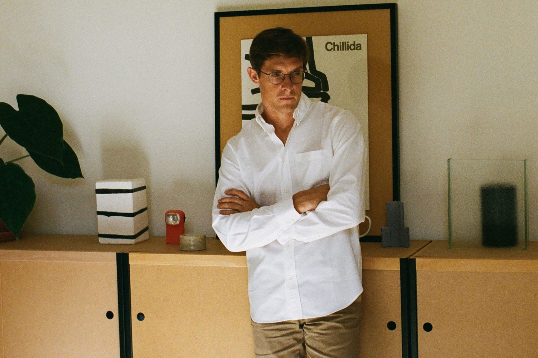
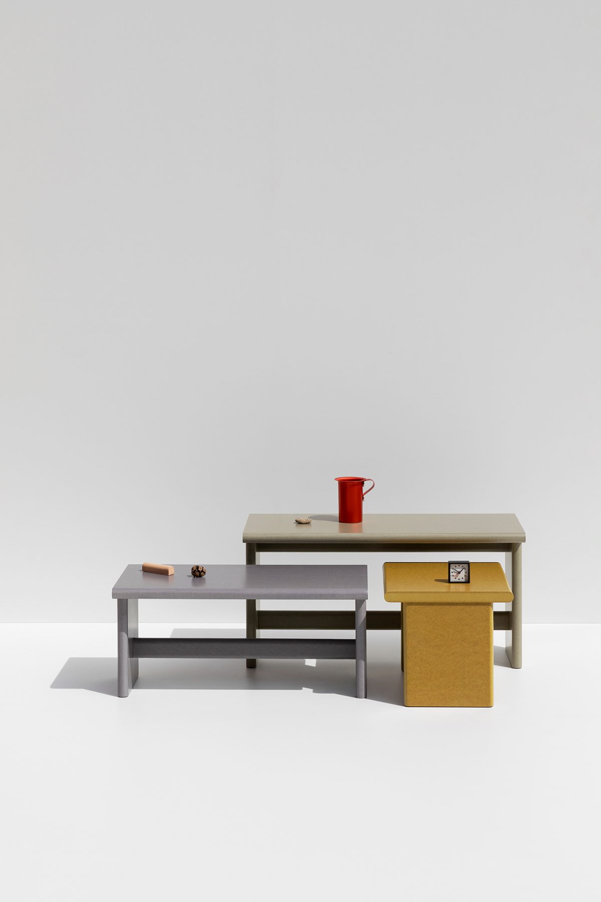
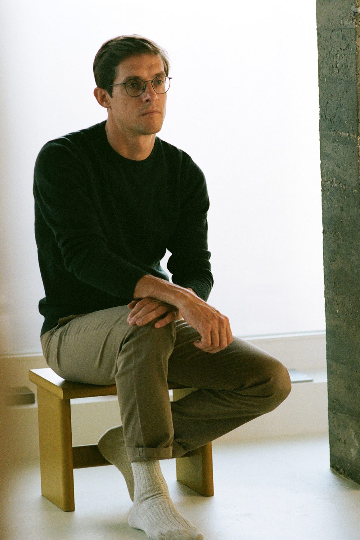
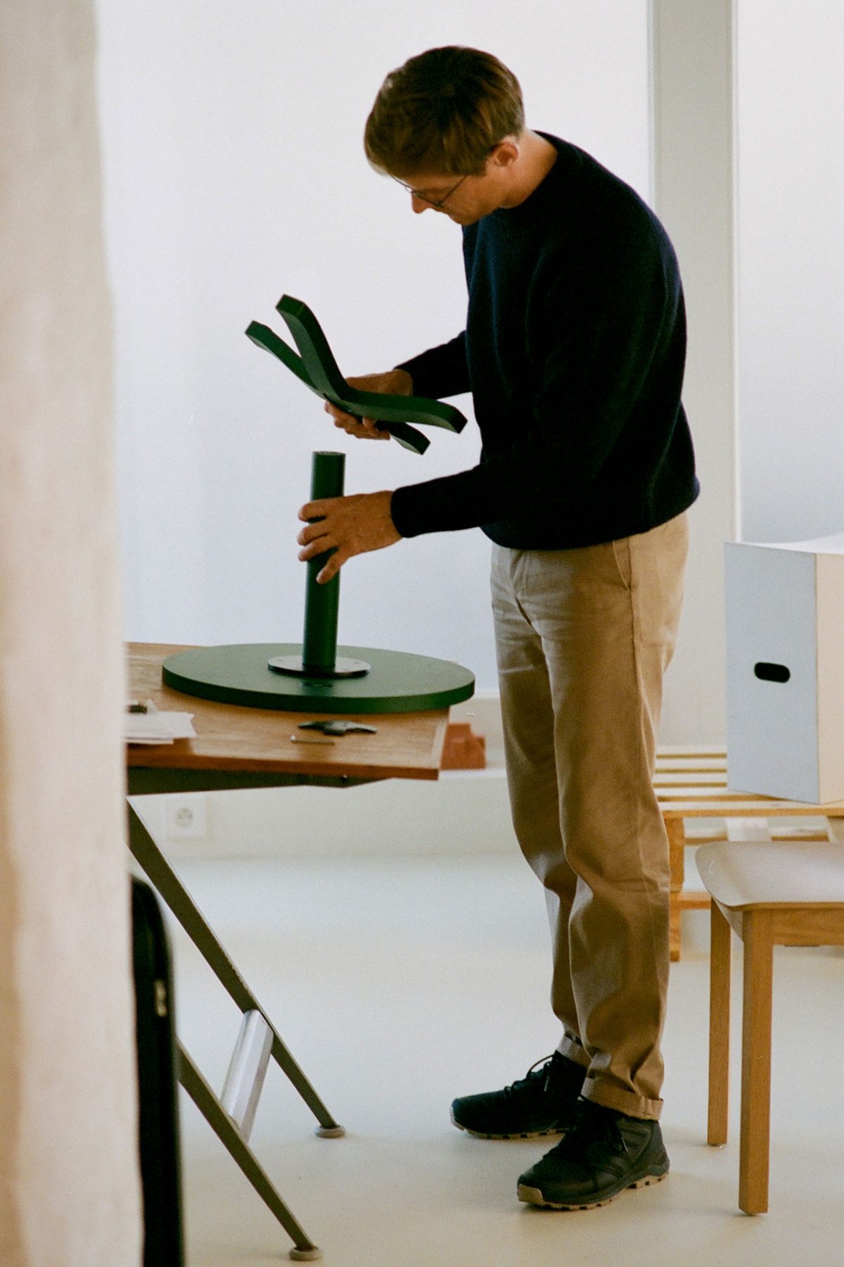
For industrial designer Julien Renault, it’s about creating objects that bring together practicality and aesthetics, merging his pragmatic approach with a deep sensitivity for colour and materials. Renault’s distinctive design perspective is shaped by his diverse influences, extending beyond the confines of traditional design. As a photographer, he draws inspiration from everyday observations, details, behaviours, and global experiences.
Hailing from a background that traverses both French and Swiss design influences, Renault brings a fresh perspective to the field, favouring Swiss efficiency and sobriety over the romantic and sophisticated tendencies often associated with French design. His commitment to simplicity aligns with the principles outlined by design luminaries like Jasper Morrison and Sori Yanagi, emphasizing the beauty of anonymous objects and the pursuit of perfection in form and function. As Renault continues to garner recognition, including his recent nomination as Belgium’s Designer of the Year 2023, his work stands as a testament to the enduring impact of a design ethos rooted in essentialism and humility.
From your viewpoint, how would you articulate the essence of design and its underlying purpose?
It’s quite obvious, but very rarely understood by the general public. The word design is often misused and it’s a difficult word to accept when you’re doing relatively simple things that tend towards the obvious. I have a fairly classic vision of my job and my practice. For me, it’s a question of designing products and objects that respond to needs, a brand and a market, while at the same time bringing my sensibility and my vision to bear.
How do you perceive the intricacies of interconnectivity, and what reflections does it evoke in your mind?
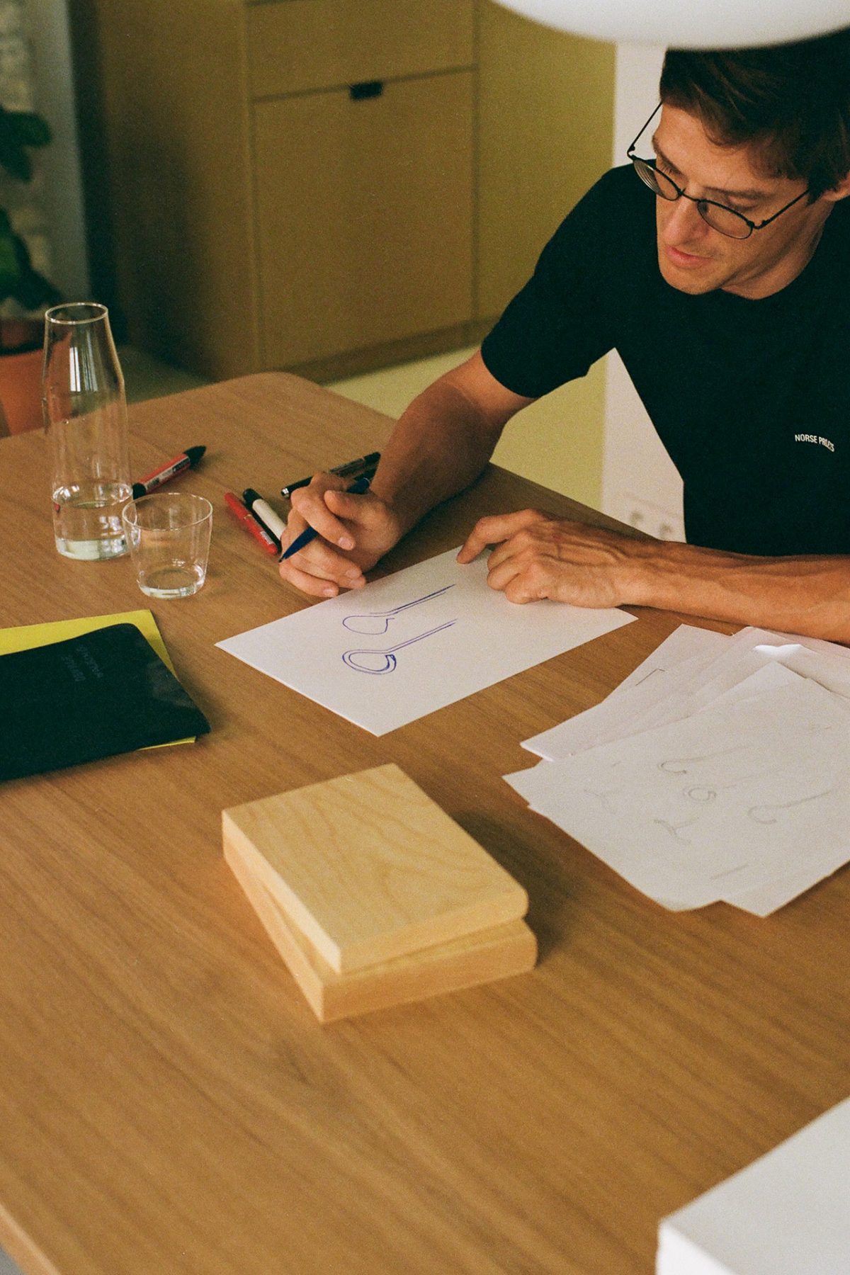
Interconnectivity can be seen in my practice by the fact that I’m a designer who works in several fields. My practice is also often linked to photography, whether for reference or inspiration, but also in the need to create my images of the final product. I like to come full circle. My photos are often a transcription of the first drawing. A detail that makes the project, the detail that can sum up a project. This work as a photographer has enabled me to build consistency into my work. It has also enabled me to develop more global art direction services.
How does this idea of interconnectivity relate to the usefulness of an object or a space?
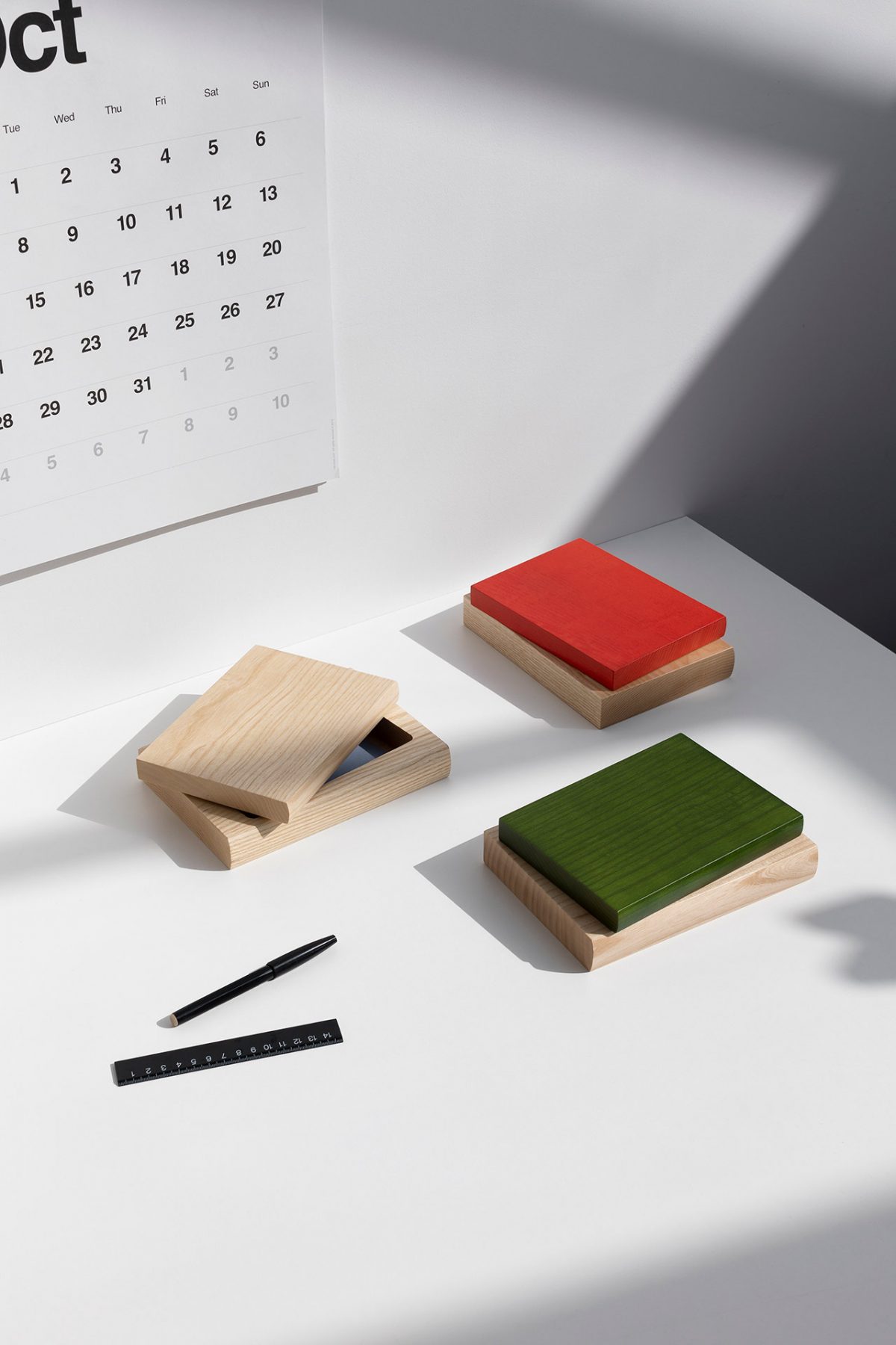
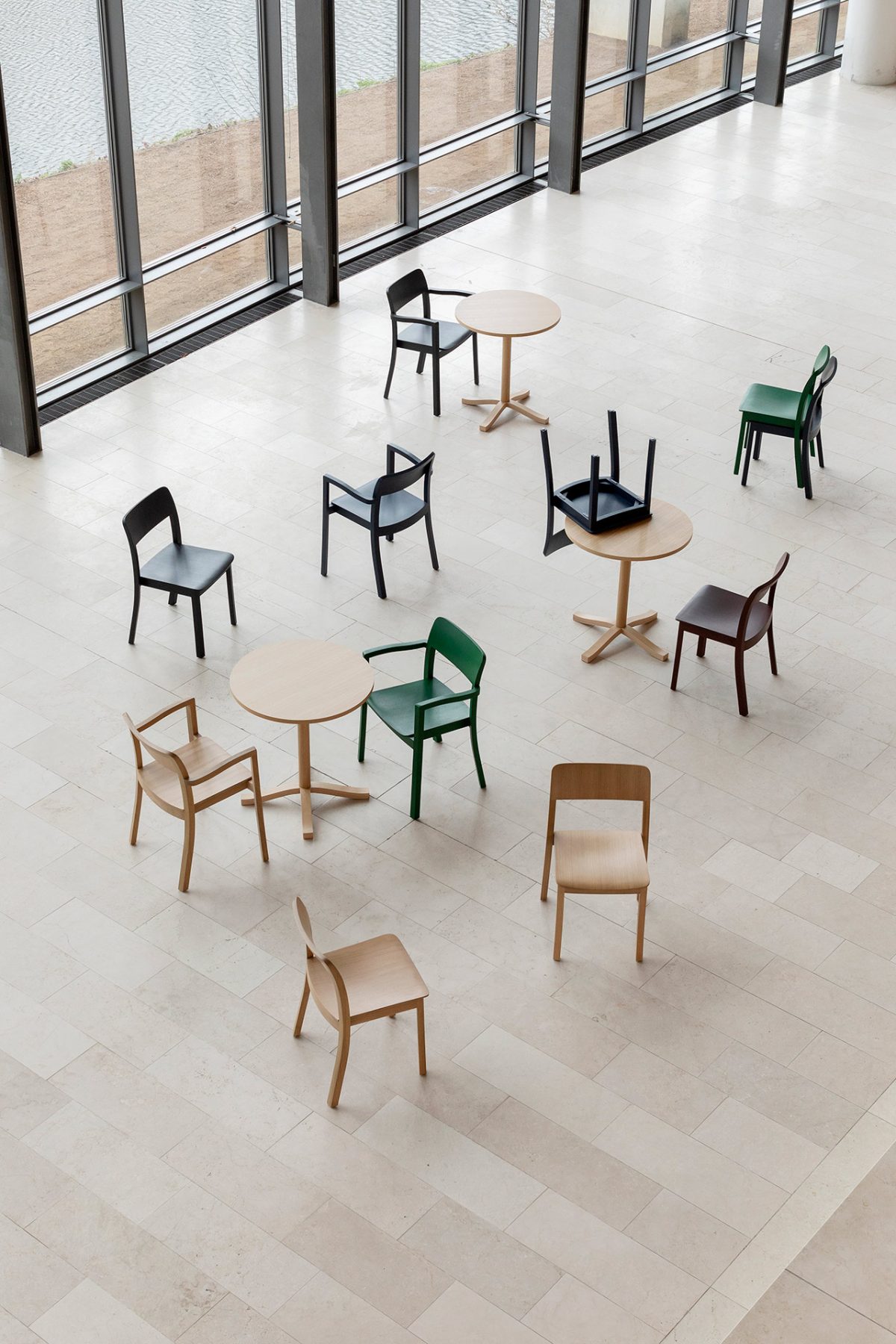
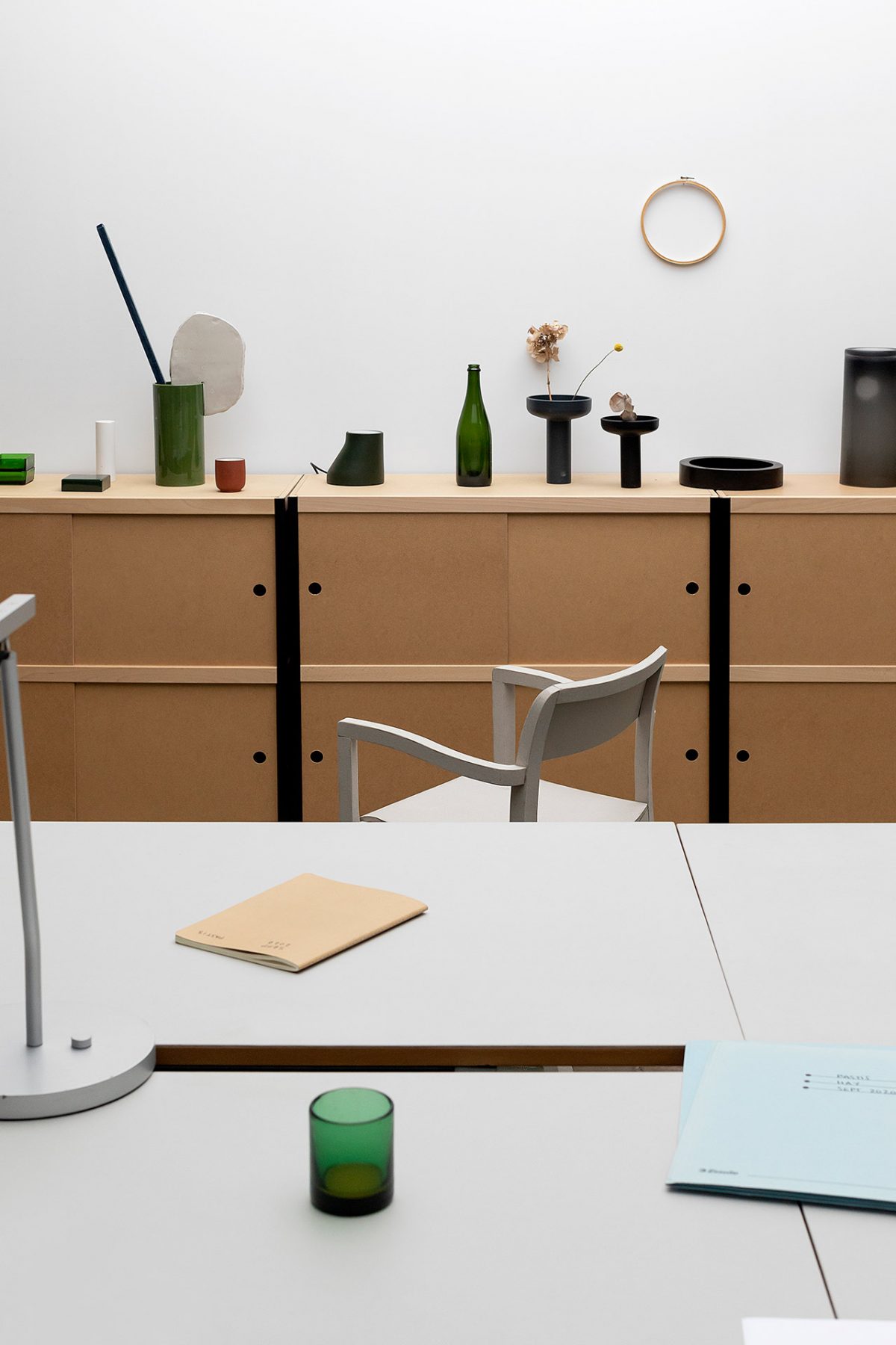
As I said earlier, photography sometimes gives me inspiration, the atmosphere of a space, the quality of the materials — an image can describe that. From an image you can create an object. The Pastis collection for HAY that I made during covid was very much inspired by the image I had of a brasserie. Another example is the Cassetta project for Mattiazzi, which was directly inspired by the image of two books on a table. It’s a way that every photographer has of accessorising a scene or an interior in a shoot. The beauty of two books that everyone can understand.
These objects fill a room and make us feel good at home. Cassetta is a tribute to that, just two planks of wood, it couldn’t be simpler. It’s also part of the history of the boxed object, the fake books that have always existed. That doesn’t mean it’s a wink, it’s a very serious object, but one of great simplicity. It has an immediate visual quality, while being very quiet.
Describe to us the differences between the approaches of French and Swiss design. How does your Belgian background factor in to your education and your approach to your work?
French design is very romantic and often sophisticated, always looking for a strong aesthetic that is part of a trend or history. Designers have this fascination for signed objects. The word ‘design’ is overused in France. It’s the legacy of the decorative arts, I suppose. I’m much more comfortable with simplicity, a kind of Swiss efficiency and sobriety, and the relationship with industrial production. This search for coherence and common sense. Swiss graphic design is also a perfect example of this, always at the service of what it’s supposed to highlight. Belgium doesn’t really have a style, the approaches are very heterogeneous. There is a lot of self-production, a trend that I don’t really fall into. I like to be influenced by all the cultures that surround me and also the different cultures of the clients I work with, be they Italian, Scandinavian, etc. I’m looking forward to the day when I’ll have the opportunity to work with Asian culture.
In the end, my work is a good summary of the courses I followed successively in France and Switzerland. My approach is sometimes quite free and sensitive—more artistic. With a sensitivity for colour and materials. But I’m always pragmatic and always questioning myself.
Outside of your formal education, what were some things that influenced your approach to design that aren’t inherently design-related?
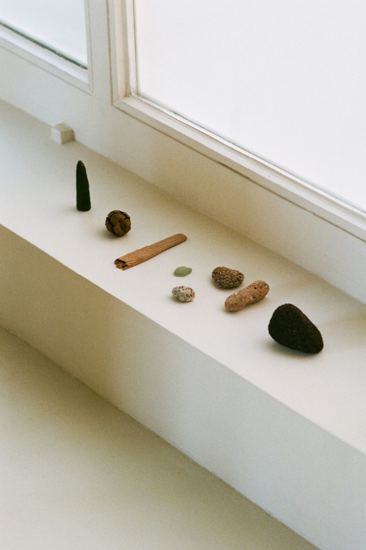
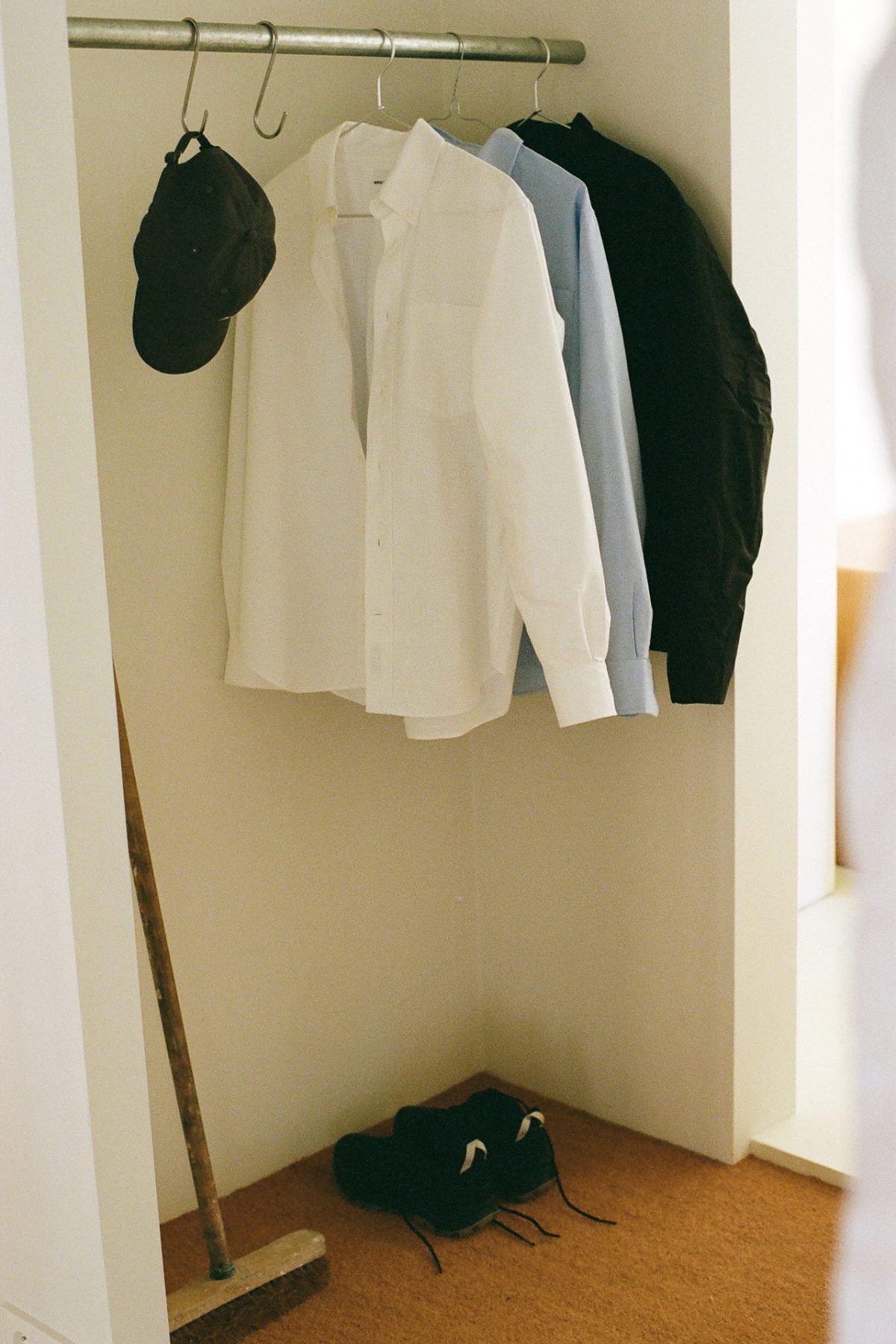
My inspirations are diverse. Being a photographer, I certainly have a gift for observation, details, behaviour and everyday situations. I observe everything constantly—an industrial standard, an unlikely assembly of elements or materials in the street. When I am travelling my eyes are scanning everything, everywhere, it’s a moment I really enjoy and find refreshing.
Which works or designers do you reference the most?
Navigating this question requires more than a few names. To provide context, I exited school just after the 2008 crisis, around 2009. In 2007, Jasper Morrison penned “Super Normal,” a thesis celebrating the allure of anonymous objects that gravitate towards a form of perfection amalgamating function, design, and simplicity. His inspiration derived from Sori Yanagi’s “The Beauty of Everyday Things.” This trend significantly impacted our generation, aligning seamlessly with the peculiarity of the moment and the subsequent years.
During this period, there was no tolerance for decadence, and this mindset profoundly influenced designers of my era who aspired to embrace simplicity. Such an ethos is notably prevalent in Scandinavian, Swiss, and Japanese design. For us, it represents a quest for legitimacy. Naturally, there are dissenting voices, with self-production and a yearning to detach from established systems being among the reactions.
Approaching design authentically is, in my opinion, the correct path. Yet, this pursuit doesn’t hinder the injection of innovation and freshness into one’s work. Italian design, exemplified by luminaries like Castiglionni, Magistretti, Mari, and others, stands as a perfect illustration of this duality. The influence of 20th-century modern architecture is substantial. Analyzing interiors, furniture, and the overall coherence of spaces, including the objects and furniture within them, contributes to a comprehensive understanding of this era’s design ethos.
Your work is rooted in essentialism. Can you describe this to us and detail how you approach a new project or concept?
Each project is part of a brand context. Getting straight to the point is also a way of making yourself understood very quickly, sometimes without having to over-explain. That’s why it’s hard to describe. Being able to summarise a project in detail is often a good thing. Explaining it through images, not having to justify an aesthetic choice, making it logical in terms of production and cost. At the same time, not forgetting the impact of the object in a daily life already filled with other objects. Above all, it’s the desire to make things that will last, that won’t age badly but will develop a good patina. It’s about things coming together to create a whole.
For me, the Design of the Year award is an opportunity to show my work and to see all my products and objects collectively. I think there’s a coherence that’s hard to describe. There are simple objects, colours and materials, but also a formal language that come together well.
Given the companies you collaborate with have their own intentions, who are you actually creating for? Who is your true audience?
Through a brand, you reach a specific audience. Each brand has a DNA, a heritage and a audience. Through them I have to think about an object that must seem obvious to them. Something that fits in with their vision and their collection, while infusing it with my sensibilities and my approach. So you have to ask yourself a lot of questions about what you’re proposing. What you propose should seem obvious, something you might not have done for someone else. Understanding the context is key.
When designing an item, do you give it a singular or a multi-faceted purpose?
That obviously depends on the object and how you use it. I like the idea of an object fulfilling its primary function, after that it’s what it gives off, the people who make it their own and the place where it is placed that will give it its own life. A chair is still a chair, and so is a dining table, but a vase, a box or a coffee table can be used to create more free-flowing ideas.
When critics remark on your “recognisable and strong aesthetic,” how does that make you feel?
As I said earlier, the first instinct that comes when thinking about a new project is intuition, and intuition is a very personal thing. It’s fed by what we like and what inspires us. What makes me happy is to see when this intuition has gone through all the stages necessary to realise the project. It can only be personal. If people recognise my work and recognise me in my objects, it’s because my path is coherent and resembles me. A strong aesthetic doesn’t mean that it has to be noisy. It’s in this discretion that I recognise myself.
Personally, I think that my objects resemble who I am. My parents brought me up with this philosophy of never getting noticed. It’s amazing how that describes my work. And at the same time, I had to assert myself afterwards, to discover who I was. It makes me smile to see that the discreet nature of my work now has a major international following. The fact that I’m described as someone with a strong aesthetic, this nomination marks an important step in the recognition of my work. For a long time, I’ve worked in the shadows, working relentlessly, patiently, building things up over the long term, convinced that what I was doing was right and needed time. Finally, recognition has arrived and it makes me think that the desire to do well, to be right, is paying off.
How does it feel to be at the vanguard, being a younger designer in this realm, of a new troupe of designers and, essentially, a new approach to design in this every-changing landscape?
Because the landscape changes a lot, I’m convinced that a rigorous approach that is built up bit by bit will end up lasting. In my opinion, aiming for the essential also helps to ensure longevity. There’s no question of talking about myself before talking about my work. My objects have to touch people first and foremost; I’m not looking to put myself forward. That’s certainly the humility of my upbringing. I’m proud that people know me and recognise my qualities through my work.
