Intents & Purposes — A Conversation with Jasper Morrison13.07.2023
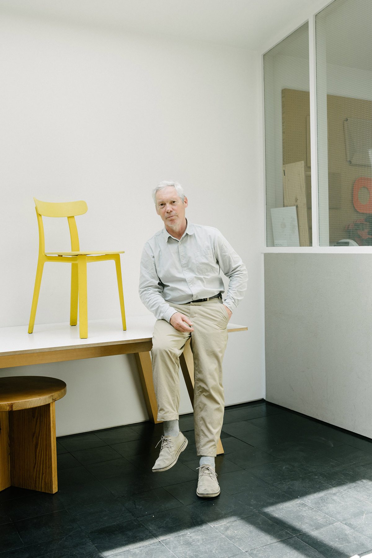
Jasper Morrison is a man of precision. With a career that spans nearly five decades, it’s more than evident that each and every object he’s created exists for a reason. His archives are filled with a sundry of pieces, ranging from bus stops to door handles, storage units, lighting fixtures, to mobile phones. Each item is meticulously considered, from its materials to the appreciation of its end user. Morrison takes this consideration one step further, in sharing his design theories in a series of publications and manifestos. His thoughts on objective and function are edifying, offering up a fresh perspective on the world and the objects we choose to fill it with. Morrison sits with us to discuss this, his impressive career to date, and his beliefs on the timelessness of design.
“Yes, you could say that I had a youthful allergy to decorative design — which still seems to me to be a superficial covering for poorly thought designs. If you can design something pleasing to the eye without decoration, isn’t that more interesting and satisfying?”
Tell us about your formative educational years. What was the end goal?
I chose Ravensbourne because they had a 3D course for first-year art students. I knew I wanted to be a designer and I was drawn to furniture design after seeing an exhibition of Eileen Gray’s work at the V&A Museum in London.
In your application to RCA, you wrote, “Ornate decoration is replaced by expression of concept and use of colour and materials.” Have your thoughts and practice always been rooted in this notion of purpose over prettiness?
Yes, you could say that I had a youthful allergy to decorative design — which still seems to me to be a superficial covering for poorly thought designs. If you can design something pleasing to the eye without decoration, isn’t that more interesting and satisfying?
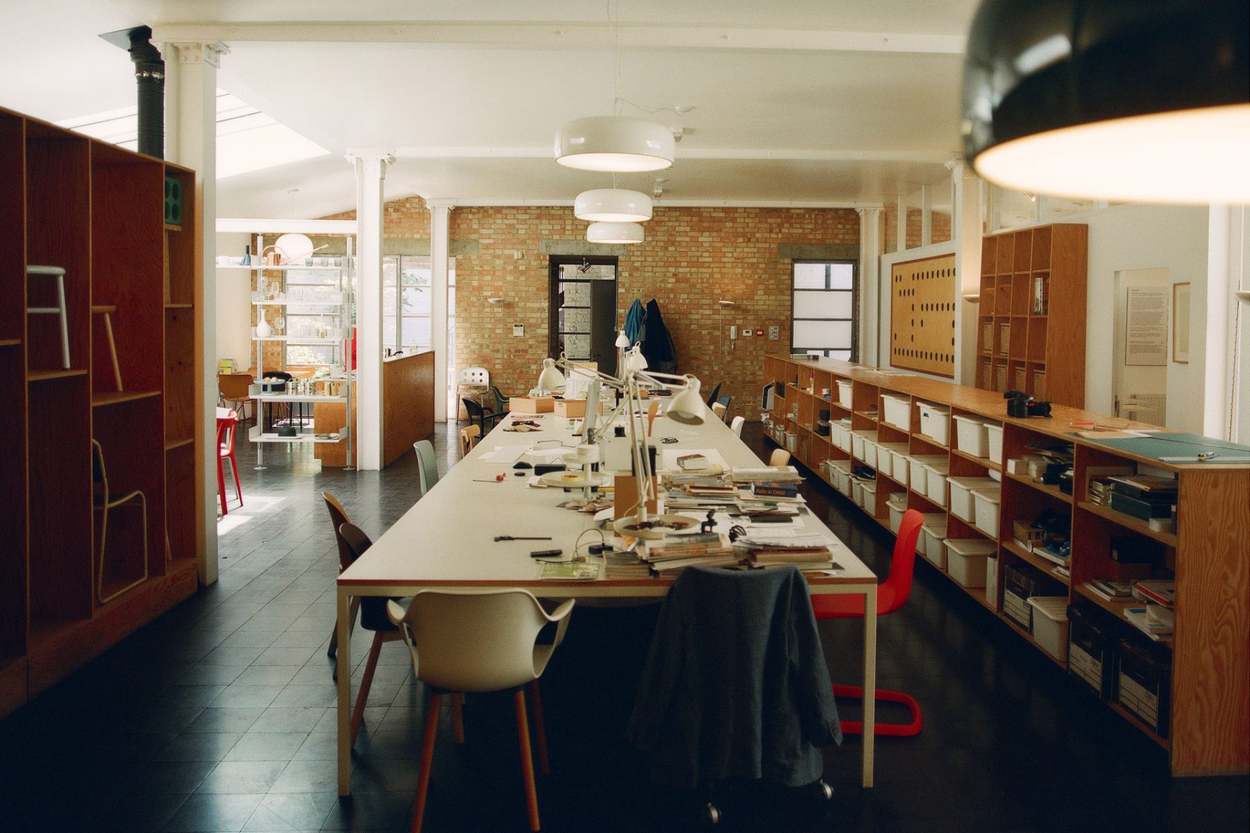
How do you manage to exhibit an object’s assets while maintaining an unobstructed approach?
I had an instinct that design was about economising on everything visual, uncomplicating things as far as possible in order to find and express the essence of a thing.
What of the balance between ideas and details, and when have the details influenced your concepts?
Details usually come later than the concept, but in the case of Three Green Bottles, the detail of the neck was the entire concept: transforming a wine bottle into a carafe and expressing my belief that there’s more beauty in the ordinary than in the special.
Do people run out of ideas, or do they recycle them with edits?
Designers need to be curious. So long as they maintain their curiosity, they won’t run out of ideas. They might not flow as naturally as they do when you’re younger, but that’s because you know more of the reality of the world of things and are less likely to challenge it.
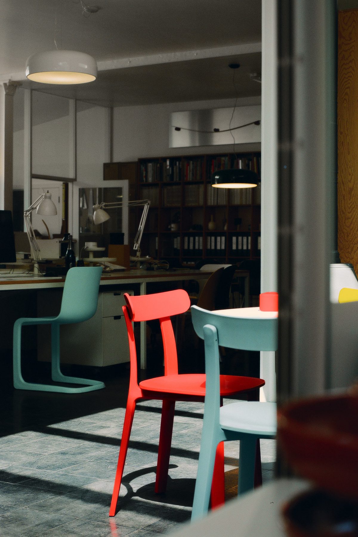
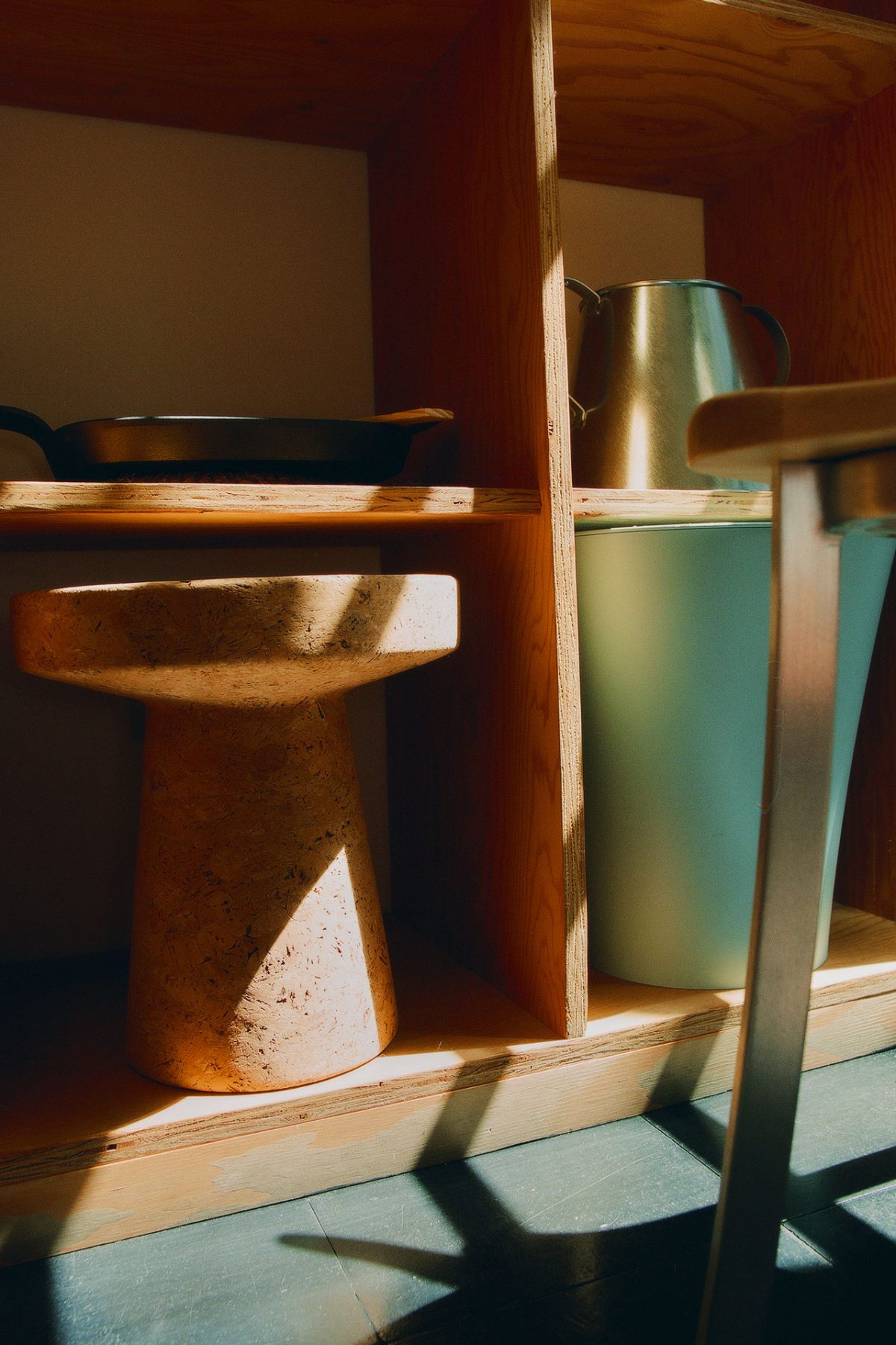
“Almost everything inspires me. Bad things inspire me to do better and good things help me recognise what the target is.”
With your exhibit, Some New Items for the Home, Part II, you established an “imaginary room”, where you could continue to develop and edit your ideas. Do all of your works exist in this room at any given time?
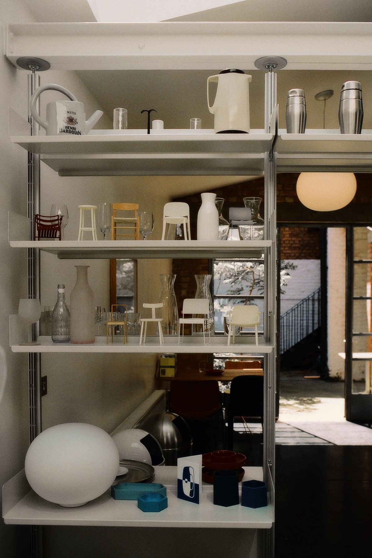
No, the room is there ready to test any new ideas. Its function is to evaluate the atmospheric effect of objects. It’s so important that new objects improve the atmosphere; if they don’t, they’re just a waste of time, energy, and materials. It’s a rather empty white box that helps to imagine what kind of effect an object will have on its surroundings.
Forgive the cliché, but, what inspires you?
Almost everything inspires me. Bad things inspire me to do better and good things help me recognise what the target is.
Let’s talk about Dada and Surrealism. Despite its radical origins, has your work been motivated by the anti-aestheticism of these movements?
It’s probably quite deeply ingrained in my thinking though I don’t consciously think about it at all. When I was buying and selling books as a student I was very into the Surrealist world and I still have a number of rare ones.
Who do you consider an influence from the art world?
I greatly admire Sōetsu Yanagi’s writing. If teaching design were limited to one book, “The Unknown Craftsman” would be enough.
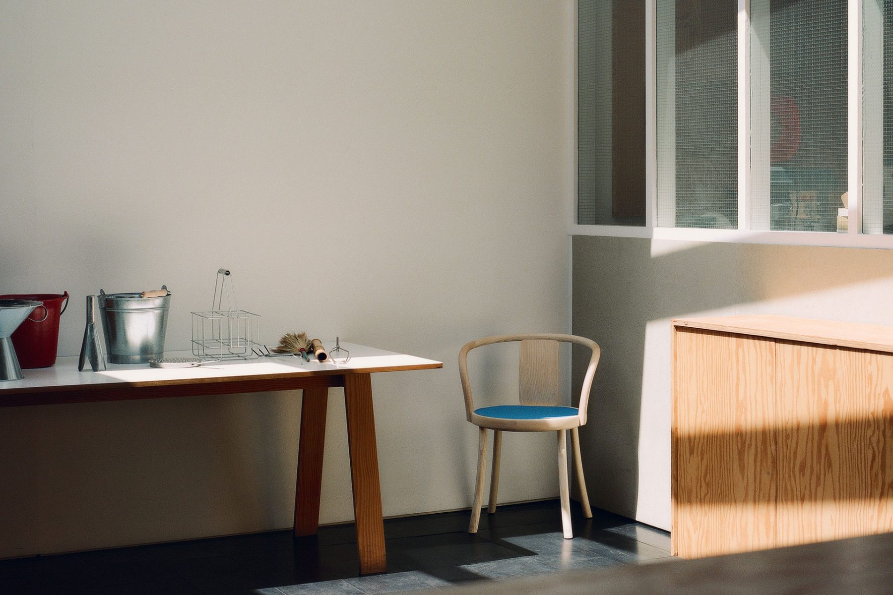
“Uselessnism was a term I invented to describe all the bad thinking we are subjected to in the public realm. It includes architecture, public projects and urban design, systems of transport, security, infrastructure, etc.”
Describe uselessnism and utilism.
Uselessnism was a term I invented to describe all the bad thinking we are subjected to in the public realm. It includes architecture, public projects and urban design, systems of transport, security, infrastructure, etc. Almost everything you come across when you are out in a town could be either Uselessnistic or Utilistic. Utilism focuses on practical solutions which improve our experience of everyday life in town.
To give a quick example, let’s take a bus terminus with a central glass-walled waiting room. The walls have, over time, been covered with posters of bus services and stickers of different travel brands to the point that passengers can’t see when their bus arrives. The stickers and posters add good atmosphere but they are unhelpful. The Utilistic solution would be to take off the stickers and posters at and above sitting eye level. It’s a rather modest endeavour to improve everyday life and put things right. Putin’s invasion of Ukraine is a perfect example of Uselessnistic thinking: it massively complicates things with no advantage to anyone. Apart from the human tragedy, think of the destruction of useful things that will need to be rebuilt, instead of rebuilding more useful things. Only an idiot or a crazed megalomaniac would think it was the right thing to do.
Your manifestos are inherently simple, underscoring your idea of simplicity.
It’s about getting the message across. It’s just better to explain things in a simple way rather than complicate the message.
You’ve spoken about the discongruity between furniture design and product design. Why is it important to execute both the conceptual design and the tangible product?
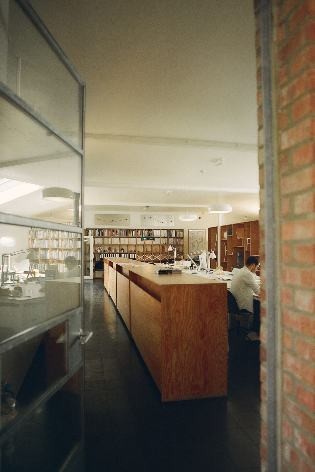
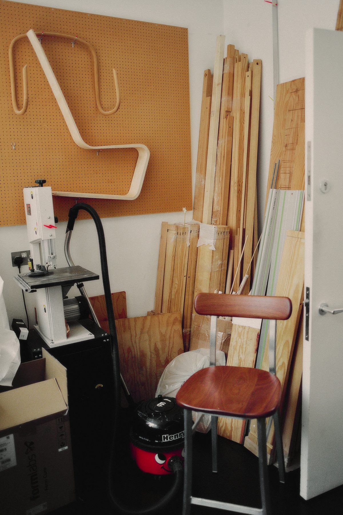
I think it keeps you in touch with the physical reality of things. From time to time we try to produce things for the small shop we have at our studio in London. It’s always a good feeling to be in touch with the making process.
Tell us about how you established your Super Normal concept.
I had become disillusioned with the design world. It seemed that we so-called professional designers were incapable of matching anonymously designed products; they had a reality about them that was more or less completely lacking in the design world I was part of. I noticed that the main problem was the authorship and the creative ego that we were all putting into our designs. Looking around, I noticed that Naoto Fukasawa was onto something similar and we started talking about it. The term Super Normal came up and we decided to make an exhibition about it, choosing objects which reflected our belief that the best design avoided this problem.
Your approach is utility first, but do you have an affinity for materials that aren’t as useful?
I like to keep an open mind but there are materials which wouldn’t naturally be useful to the type of projects we do.
Colour periodically makes an appearance in your works, and does so with impetus. What leads you to decide to use colour?
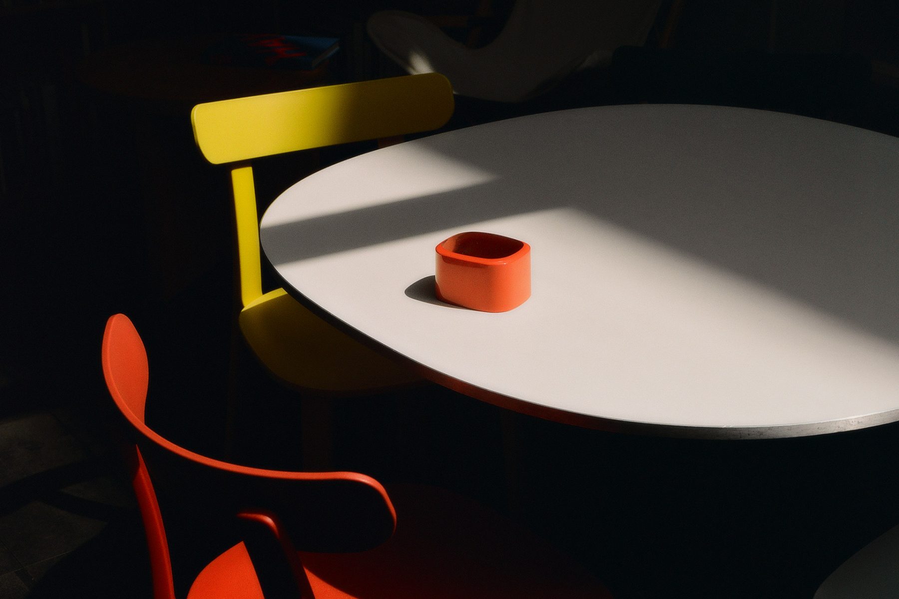
I love colour almost as much as I love non-colour. There are certain colours which enrich a design and make for really interesting atmosphere.
Some of your early pieces, like the Handlebar Table and the Coat Stand, align with the idea of “readymades”, much in the way Duchamp intended: “prefabricated objects isolated from their intended use and elevated to the status of art.” Is this a fair designation?
I think in the designer’s mind, objects can’t be isolated from an intended use. So it was all about re-purposing things usefully rather than isolating them from usefulness.
There’s a distinguishing shift in your designs, especially once you started working with Vitra and with your Some New Items for the Home exhibit. How did this come about? What was your outlook once you left school?
It came a bit earlier than Vitra and it was a reaction to the Memphis movement. I was excited as well as repelled by Memphis, which seemed to me too arty and loud. I went the other way and discovered my interest in atmospheres and how objects affect them. Looking for quieter expressions that were nonetheless effective in improving atmosphere.
You don’t discriminate in your work, as it runs the gamut from kitchenware to architecture. Was it always your goal to create objects across such a broad spectrum?
I very much enjoy working on a lot of different things at the same time. Although we always have chair projects, it’s very helpful to have a variety of other things to think about.
You have a longstanding relationship with Muji. How do you design within your principles for such an accessible and ubiquitous brand?
Muji is such a special brand. Though it can be difficult to design things for them, there’s no other brand which suppresses the loudness of objects to the extent they do. With the range and diversity of what they offer, they’re the ultimate Utilistic brand.
When and why did you make the decision to start designing electronics?
It was quite a simple decision. I accepted a project offered to me by Sony to design a family of audiovisual products, hi-fi, speakers, and a TV. At that time, John Tree was working for them in their UK design studio; he was assigned to partner with me on the project. What we came up with never made it into production but it did have a lot of influence on Apple.
Out of all your pieces to date, which defy the rapid obsolescence of our technologically-obsessed world?
It might be the Moon tea cup I designed for Rosenthal or the Flos Glo-ball lamp. Both designs are more than 25 years old and still look fresh. Or, the FSB 1144 door handles, perhaps, which are more than 30 years old. They all show that the visual qualities of objects can be lasting. There is no better approach to sustainability than making things that have a long and useful life.
Captured by Paul Hempstead
Portrait by Thomas Martin
